Dynavics
Brand identity for a Microsoft implementation partner
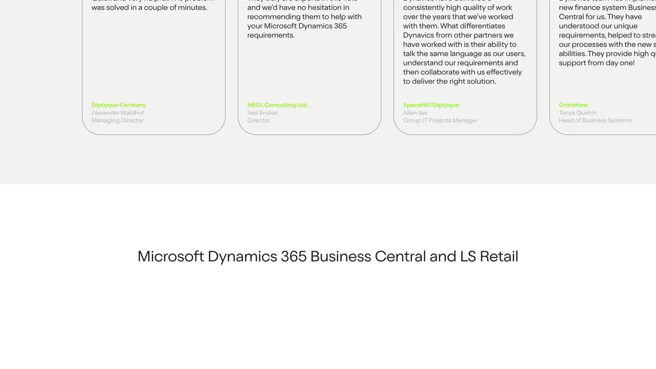
Since launching, we’ve seen a significant boost in lead quality and received great feedback on our distinct branding and logo, this has really helped us stand out against competitors.



Dynavics
Brand identity for a Microsoft implementation partner
Dynavics is a Microsoft implementation partner that helps with the design, development and support of Microsoft Dynamics 365 Business Central.
Aware that their dated brand was holding them back, the Dynavics team challenged us to create a new brand identity. The brand needed to align with their target customers and stand out against competitors.
- Lead time:
- 5 Months
- Sector:
- Corporate, Technology
- Target type:
- B2B
Clients choose Dynavics over their competitors because of their high level of customer service and their passion for what they do. It was important for the new brand to capture the spirit of the team while also representing a market leading tech business.
The existing Dynavics brand included a limited number of colours and assets which made it difficult for the marketing team to effectively create new materials. We needed to expand the brand to provide a broader visual toolkit that could still be easily implemented by the team.
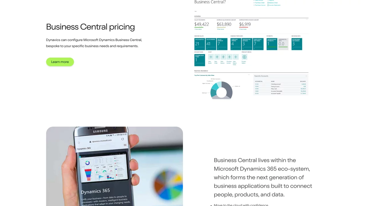
We created branded assets to showcase the Business Central systems that Dynavics deliver. The assets used a combination of screenshots, photography and brand shapes, and included animation options to transform the imagery into dynamic assets.
To produce a warm and approachable feel to the brand, we created hand drawn icons that were animated for digital use, adding depth and visual interest to the page.
We selected typefaces that strike a good balance between the straightness and roundness of characters. This delivers a friendly digital feel and aligns Dynavics with businesses such as Google that use font in a similar way.
We delivered a set of brand guidelines to outline how the new visual brand should be applied online and offline. The guidelines tie the various brand elements together to ensure that the Dynavics team are able to flexibly and consistently use the new brand identity.
We created a vibrant new logo that would stand out against competitors. The simple nature of the logo provides the flexibility to use it in a variety of contexts. It is responsive and can be adapted to a monochrome colour palette.
We broadened the brand colour palette to provide a greater level of flexibility and enable Dynavics to assign colours to their different business offerings. We paired the colours to simplify usage for the team.
We developed a chat box shape to give the brand depth and form. This shape is used within the logo, background patterns and image masks and portals, and ties the range of brand assets together in a unique way that is distinct to Dynavics.
Following the rebrand, we worked with Dynavics to redesign and build their website, implementing the new brand and providing their marketing team with the dexterity to manage their content and brand independently.
Our new website design focused on appealing to Dynavics’ target audience and improving conversion rate. We also created an SEO strategy to generate a greater amount of high quality organic traffic to the website.
We started working with Plug & Play to redefine our brand identity and update our outdated website. Their team delivered an outstanding project from start to finish and have provided amazing ongoing support ever since. Since launching, we’ve seen a significant boost in lead quality and received great feedback on our distinct branding and logo, this has really helped us stand out against competitors. The skillset and project methodology of the whole team is remarkable, we look forward to working with Plug & Play again in the future!
Louise Woodruff, Communications Officer @ Dynavics