

D Law
A new brand and website for a US law firm.
“They delivered a sector-leading brand, website and marketing strategy for us, capturing the empathetic nature of our business while also producing something bold and authoritative.”










D Law
A new brand and website for a US law firm.
D.Law is a California based law firm that specialises in employment law.
Having recognised that the legal sector digitally lags behind other industries, they challenged us to combine professional legal services and marketing in a way that hadn’t been done before. Their team asked us to overhaul their brand, website and digital footprint.
- Lead Time:
- 5 months
- Sector:
- B2C, Law
- Target Type:
- B2B
- Website Goal:
- Reposition visual brand, Generate new enquiries
Having identified an opportunity to lead their market by combining their established reputation with great marketing, D.Law commissioned us to transform their visual brand and website. Outwardly, they looked like every other corporate law firm, with no clear point of difference or visual alignment with the clients that they wanted to attract. They challenged us to draw inspiration from forward-thinking disruptors in industries such as insurance and banking that are leading in-industry change.
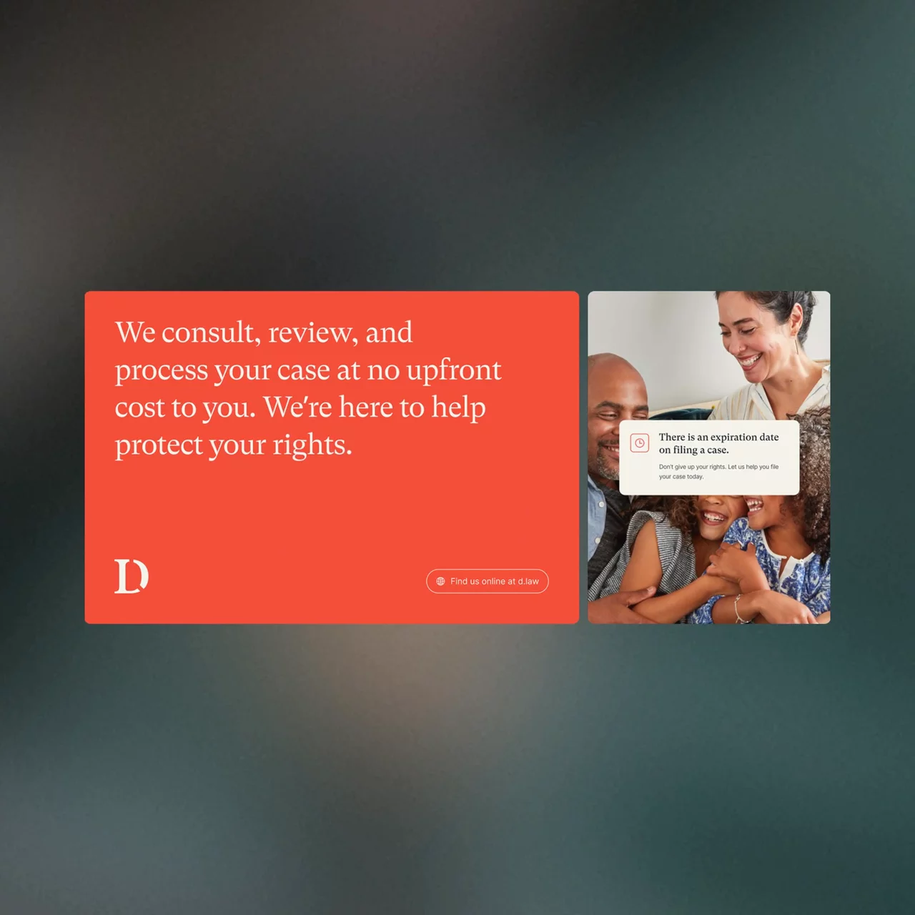
D.Law offer an at-need service and many of their clients find them during a period of distress in the workplace. They wanted to create a feeling of safety for prospective clients where they could trust that D.Law had the ability to win their case. We created an approachable and professional brand by overhauling their colour palette, logo, typography, shape and form, and imagery.
D.Law wanted to be authoritative while also fun, cool and approachable. Our first step was to calibrate these traits and understand the balance – were D.Law more serious and authoritative or were they fun and soft? The brand concept phase explored 2 visual expressions of the brief in a mood boarding process. One concept was a more serious expression of the brief and the other was a softer approach. This visual calibration enabled us to better understand the brief and client vision for the brand.
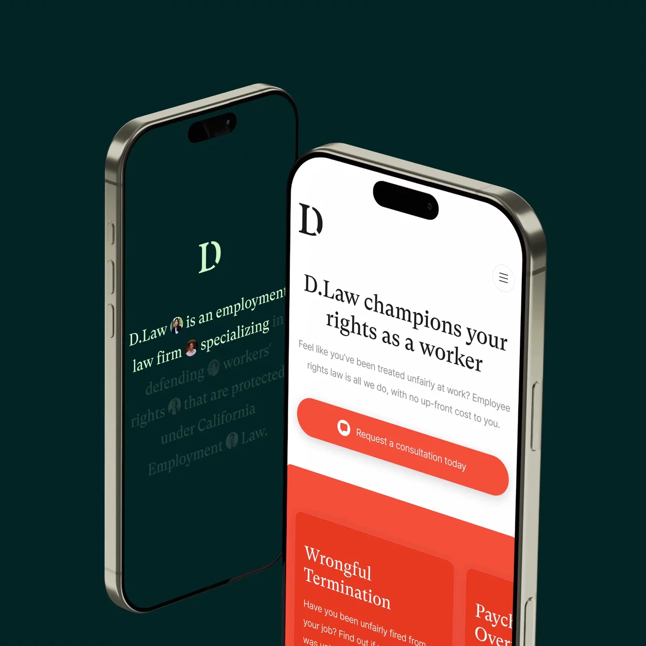
We delivered a new responsive logo that can be simplified to a ‘D’ icon on smaller screens and social media.
We selected an approachable colour palette of greens and earth tones that can be accented by a bold grapefruit colour.
We selected a serifed font as a nod to the traditional roots of the legal sector and to convey authority and confidence.
We selected authentic imagery that showcases the real people that D.Law serves. The imagery is clean, simple and positive.
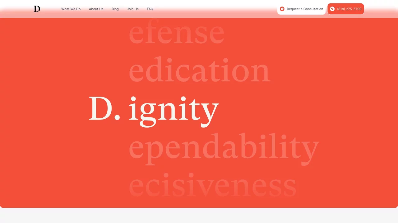
We drew inspiration from the new logo to develop brand devices that create design depth. The . from the logo is used as an image device that holds mini profile pictures. These are accompanied by names and stand for representation and impact. The hard and soft lines of the font feed into the slightly rounded boxes that are used throughout the site. These shapes break up content, highlight text and create a sense of togetherness within the content and design framework.
We delivered their new WordPress website around the new digital strategy that combined keyword research with website structure, landing page recommendations and entry and exit point reviews. The website design utilises the new brand and incorporates video content to achieve an approachable feel, while demonstrating knowledge and communicating key messages.
D.Law had domain metrics that could be competitive for a number of keywords. They were competing against some very well established businesses with extremely competitive positioning. Our job was to assess the keyword battles that D.Law had a statistical chance of success with, focusing their resources on strategic targets. The new website was designed and built with SEO best practice at its centre, feeding into every touch point of the design and development.
D.Law made the business decision to change their domain name as part of their rebrand. We managed the domain migration, ensuring that a best practice process was followed and that the client’s domain metrics and competitive position were seamlessly transferred with the launch of the new site.
